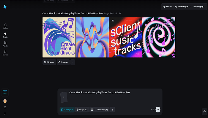
There’s a pleasing lie people tell about album art: they can almost hear the music when they look at it. That sensation—where sight bleeds into sound—is the playground of synesthetic branding. Start by sketching a mood with an AI photo generator to discover the palette and light that feel most musical for your campaign. Dreamina makes it easy to iterate on those mood frames fast, so you can audition for a dozen “soundscapes” visually before you commit to an entire identity system.
This isn’t about literal notes or waveforms; it’s about crafting visual metaphors that cue tempo, timbre, and cadence. A bassline becomes a heavy slab of color. A tremolo translates to a dashed pattern. A chorus blooms like a repeated motif across the layout. When brands learn to speak in these cross-sensory terms, their work stops being merely seen and starts being felt—like music you can reach out and touch.
Rhythm and color: the palette as tempo
Color choices create an immediate emotional beat. Fast, staccato motion reads as bright, high-contrast hues; slow, ambient pieces favor muted tones and soft gradients. Think of a palette as a drum kit: primary colors are the kick, secondary accents are snares and hi-hats, and tiny tertiary hues are cymbal shimmer. Use contrast to establish tempo—higher contrast accelerates perceived rhythm, while closer tonal ranges create meditative stillness.
- Rapid tempos:neon contrasts, saturated primaries, aggressive complementary pairings
- Mid-tempos:jewel tones with one bright accent and moderate contrast
- Slow tempos: desaturated washes, analogous harmonies, soft vignette
These are starting templates, not rules. Your brief should dictate whether the brand feels like a jazz quartet, a techno drop, or a pastoral lullaby.
Tactile tokens: stickers as physical chorus
Physical artifacts carry sonic memory. Turn a dominant visual motif into stickers that fans can place in the world—on laptops, instruments, notebooks—so the brand becomes part of the listener’s daily soundscape. Use Dreamina’s sticker maker to echo your rhythm: repeating motifs, a small set of colors, and crisp shapes that survive handling and time.
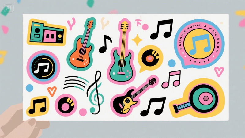
A few well-designed stickers can become mnemonic devices, cueing the same feelings in fans every time they glance at their water bottle while listening to your playlist.
Shapes that hum: geometry as instrument
Form can suggest pitch and movement. Rounded, fluid shapes read as warm, melodic voices; sharp, angular geometry suggests percussive attack and digital grit. Layering is a conductor’s baton—stack shapes to build polyphony, or isolate single forms for minimalism.
- Legato visuals:flowing arcs, ellipses, and overlapping transparencies that suggest sustained notes
- Staccato visuals:sharp polygons, repeated dots, and grid snaps that imply rhythmic hits
- Modulation: gradual morphs between shapes to mimic pitch bend or filter sweeps
Micro-interactions—hover glows, slow morphs, microparallax—further animate these forms into living instruments.
Motion as melody: pacing the viewer’s ear
Motion can be subtle and still extremely musical. Short, repeating loops function like ostinatos; slow reveals are more like crescendos. The key is to align the loop’s tempo with the user’s attention span and the platform’s affordances.
- Social thumbnails:1–3 second microloops with a single satisfying movement
- Hero banners:layered parallax with a slow, cinematic pace
- UI micro-animations:tiny feedback beats—button thumps, badge pulses—that act like metronomes for the interface
A microloop that’s slightly off-beat will feel unsettling; a perfectly timed loop feels inevitable. Test timing on-device.
Layering: building a sonic story
Create arcs across materials: the website header sets the key, a social clip establishes rhythm, and print collateral adds texture. Narrative layering helps audiences “hear” the brand before they ever click play.
- Begin with a keynote image that announces the sound-world
- Follow with process frames that expose instruments (type choices, textures, motion vocabulary)
- Finish with acquireables—stickers or posters—that let fans bring the sound home
These are touchpoints in a very short symphony; each one should reinforce the central motif so the identity stays coherent across channels.
Type as voice: choosing a vocal timbre
Typography carries phrasing. Rounded typefaces feel warm and breathy. Condensed, high-contrast faces read like sharp vocals. Consider musical terms when naming type directions: “soprano sans” for light, airy headlines; “baritone slab” for authoritative labels. Use rhythm in typesetting—play with leading and letterspacing to create syncopation. A single word with stretched tracking can feel elongated, like a held note; stacked caps can create a drumroll effect.
Textures and materiality: analog warmth vs. digital sheen
Textures translate timbre. Grain, paper fibre, and varnish are the visual equivalents of analog fuzz and reverb. Clean vector gloss is modern synth. Mixing materials gives you an ensemble rather than a solo.
- Analog warmth:light grain, halftone sweeps, paper overlays
- Digital sheen:subtle gloss highlights, crystalline noise, high-frequency sparkle
- Hybrid textures:a digital pattern laid over a tactile paper scan to evoke both clarity and warmth
These choices matter more in physical executions (packaging, posters) but also influence perceived sound in digital mediums.
Score your visuals with Dreamina — the studio sprint
Now let’s get practical: a short Dreamina workflow to prototype a visual “track” for your brand.
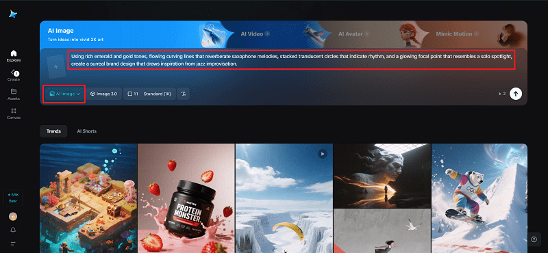
Step 1: Create a text prompt
Head to Dreamina and explain the visual soundtrack you’d like to create: mood, palette colors, principal forms, and emotional tempo you seek.
For instance: “Using rich emerald and gold tones, flowing curving lines that reverberate saxophone melodies, stacked translucent circles that indicate rhythm, and a glowing focal point that resembles a solo spotlight, create a surreal brand design that draws inspiration from jazz improvisation.”
This exercise will help establish the visual tempo before you build out the system.
Step 2: Refine parameters and generate
Select a model optimized for texture and lighting accuracy, choose an aspect ratio appropriate for your hero canvas, use 1k for speedy exploration or 2k for refined exports, and click Dreamina’s icon to create variations. Select the render that expresses most strongly the desired rhythmic energy and tonal equilibrium.
Step 3: Personalize and download
Refine the central form using Dreamina’s customisation tools, inpainting safe areas for copy, canvassing out for visual bleed, and retouching subtle lighting so gradients sing at thumbnail scale. When the artwork reads large and small, press “Download” to send the master files to motion experiments and collateral.
Working with identity: the emblem that hums
A logo isn’t just a mark—it’s a motif that can be scored. Test simple animations that let the emblem breathe like a metronome or bloom like a chorus. If you need streamlined variants for microformats, run a handful of minimal concepts through Dreamina’s AI logo generator to see what compresses best into a single glyph that still reads as musical.
Consider emblem motion: a glyph that subtly pulses at a fixed bpm becomes a living badge; an emblem that unravels into constituent shapes provides satisfying reveal choreography.
Measuring resonance: does the visual really sing?
Track more than impressions. Look for time-on-post, loop completions, sticker orders, and qualitative feedback: do people describe your visuals in sonic words—”lush: “pulsing,” “crisp”? High save and share rates indicate the imagery is doing the melodic work of memory-making.
Quick production hygiene
- Build a motif library:three primary shapes, two gradients, and one texture.
- Create motion presets:pulse at 60–90 bpm, slow morph at 12–18 seconds, and a quick accent at 3–5 frames.
- Export color-locked assets:motion tweaks don’t shift perceived harmony.
Conclusion
Pairing visuals with an imagined soundtrack is a powerful brand exercise: it forces you to choose emotional verbs, not just nouns. When you design with rhythm in mind, your visuals do more than look good—they sound inevitable.
Use Dreamina to sketch the first phrases, iterate the chorus, and export a suite of assets that can perform across screens, posters, and sticker sheets. The goal is to make audiences hum your palette in their heads—and that’s as good as a hit single.